Project Brief
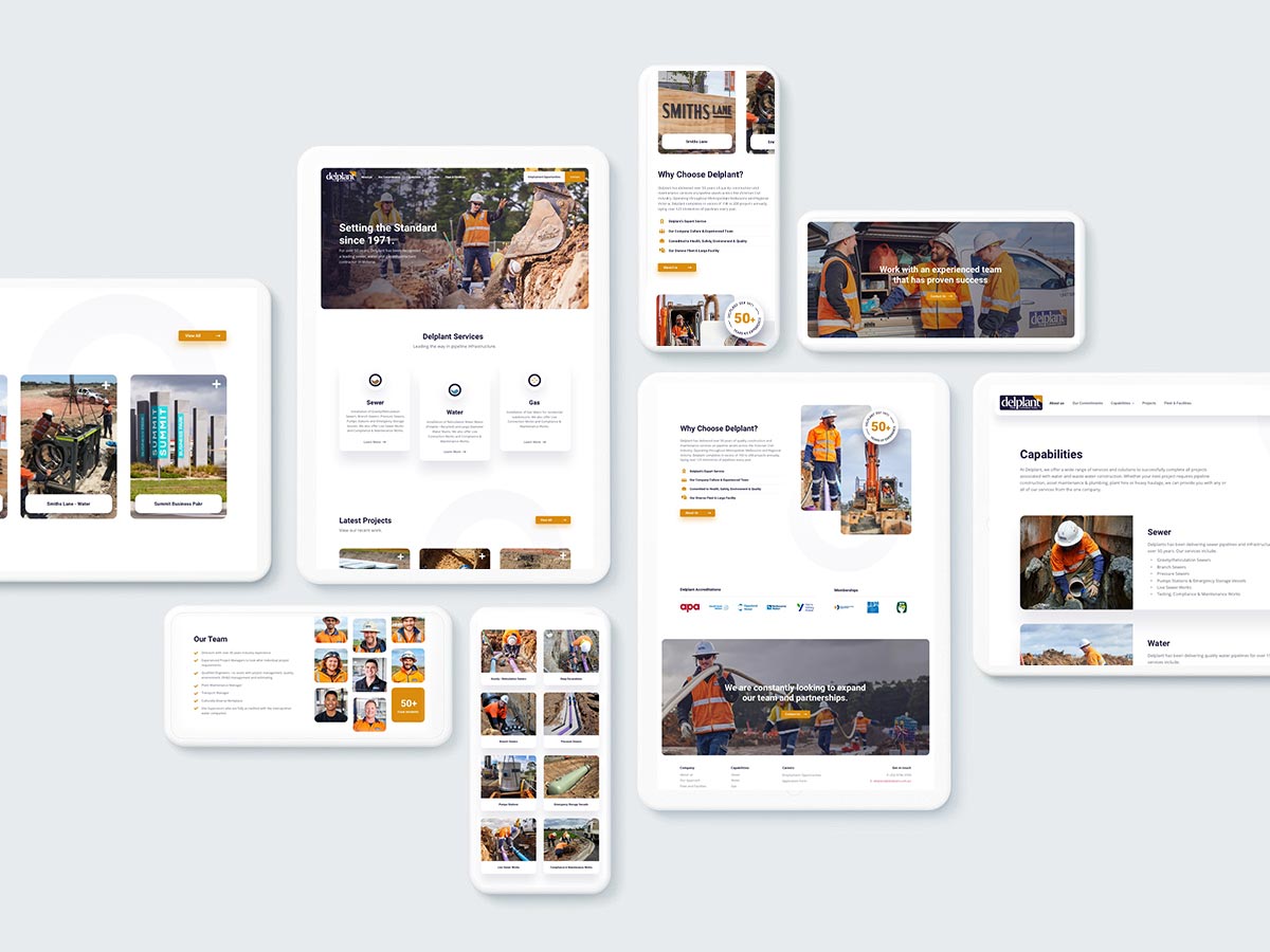
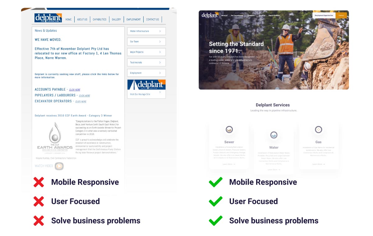
For over 50 years, Delplant has been recognised as a leading sewer, water and gas infrastructure contractor in Victoria. The old Delplant website did not represent their heritage, industry standard and high quality of service. This lead to issues with recruitment, sales and usability. We took a deep dive into there business to unpack there pain points and find out how we can solve there problems with a new responsive and engaging website.

Design Elements
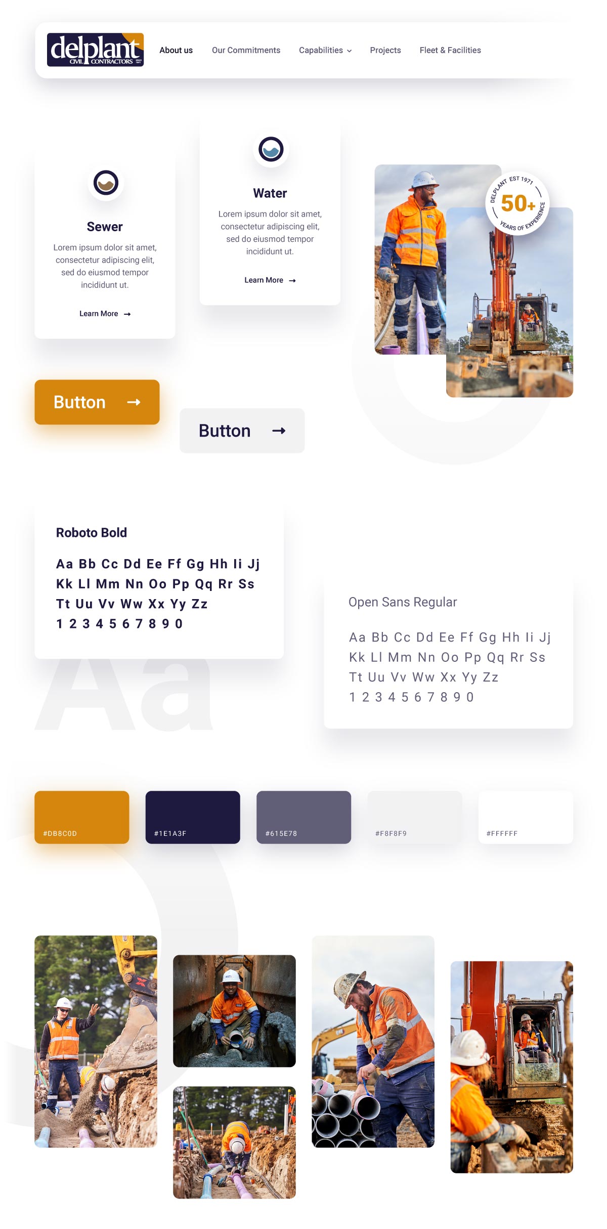
It was important to use an ultra modern and clean design system to marry up with Delplant’s top shelf business standard. With no style guide or brand material to reference we had creative freedom to create something that would be engaging, easy to read and meet usability standards. The fundamentals of our design system was to use white space, shadows, rounded corners and orange CTA buttons that will grab your attention when needed. A creative feature was to use subtle grey round shapes that took inspiration from the Delplant logo but also references the key item that ties all services together.. Pipes.

UX & Development Process
The Delplant website project followed our typical development process. Discovery, Wireframe, Content creation, Mockup and Development. During the content creation stage we delivered a full photography brief with all web requirements along with general recommendations. We delivered all pages in one phase with no delays. To learn more about our website process please reach out.

Project Objectives Checklist
We outlined a detailed list of goals and objectives some of which included: Premium UX Strategy, Modern, clean and easy to navigate, mobile responsive, improve recruitment information and forms, custom project feed, highlight company culture and showcase services. We delivered a website that included all items listed ultimately solving all the issues from old website.

James Delaney – Fleet and Facilities Manager – Delplant
